Mid-fidelity Interactive Prototype
Methods
User Interview
Usability Testing
Wireframes
Interactive Prototype
Background
This project is the final project of 6 weeks UX Design course at RMIT, Melbourne, Australia.
English Confidence Unlocked is an English coaching website, for upper intermediate to advanced learners, focuses on improving learners speaking and listening skill to the levels they need to reach. Besides the coaching section and a live workshop, the site also offers useful tips and articles to achieve English skill with confidence and efficiency.
Go to Mid-fidelity Prototype : https://www.figma.com/proto/IgjIRoHfZpGQJ0Z3LPSVW4/UX-User-Flow?node-id=284169%3A450&scaling=min-zoom
The Hunch
I have a hunch that users have struggled with the purpose and vision of the website. The navigation is difficult for a user to find the right course of their interest.
• Heavy text information confuse users and easy to lose their attention.
• The inconsistency step will break the user flow. When selecting a course or enrolment, the website leads users to new tab of external website instead of staying on the same page.
• Too many steps of the checkout process will decrease the number of applicants.
Vision of Success
To improve the user experience of this website, help users have a better understanding of courses details, make sure they find the course they are looking for and smoothly take them through the registration of the free webinar session. So that the number of further learners will be increased.
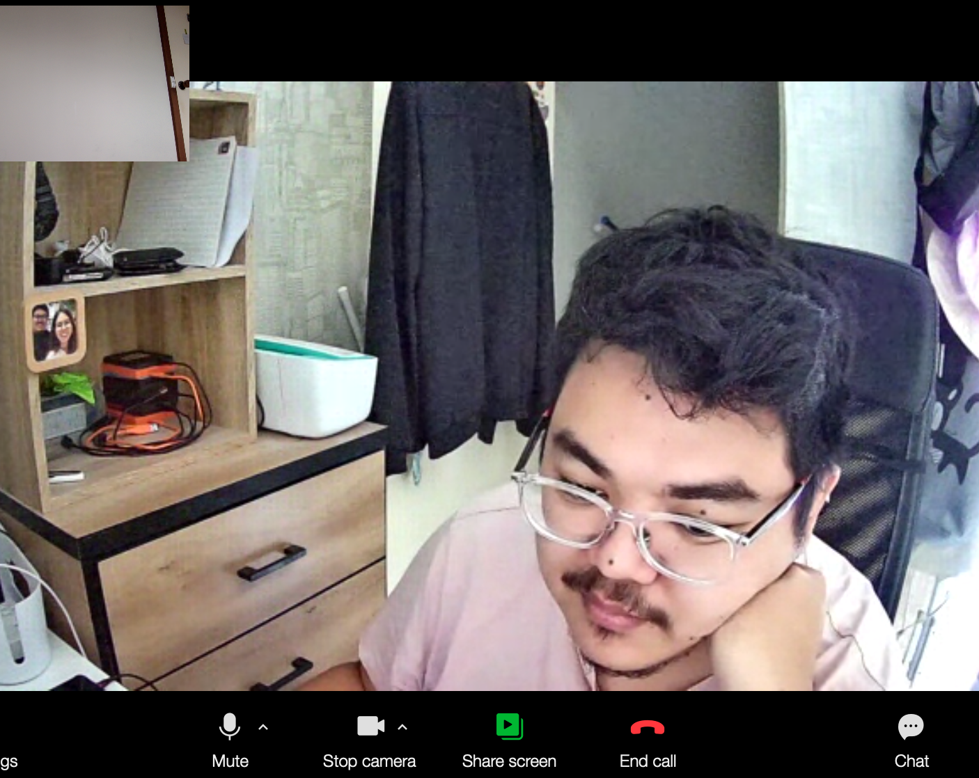
First User Interview
User Research
Research Approach is to test at least 3 users in user testing. The interviewee were asked to walk through the original website and to complete the registration task. Interview feedback will be organised in affinity diagram to identify and group issues then turned these information to find user insight and recommendations for the next step.
Interview Questions
Q1: Can you explain what this website is about?
Q2: How do you feel about it?
Q3: Can you find the course details and registration checkout?
Q4: Have you used any other similar website and what else do you want to see more from here?
Insights & Recommendations
1. Users confuse about the purpose of the website. Text overwhelm distracted users from heading straight to see course details and likely to skip the page.
It is important to keep users have a clear mind yet still have fully understood the purpose of the website.
2. Users need to explore about price and course details for each course before applying or giving their information.
Modify layouts that easy to deliver useful information for a user to make a decision.
3. Error navigation make them lost their way and didn’t know where to go next.
Refine the navigation within the site, create an environment that makes users want to discover through the course details page.
4. Multiple tabs and clicks was a frustrating experience. Too many registration steps prevented them from completing their task.
Reduce unnecessary steps and messages that might make users feel overwhelmed by replacing them with illustration or photos that tell the same story
Affinity board of user testing
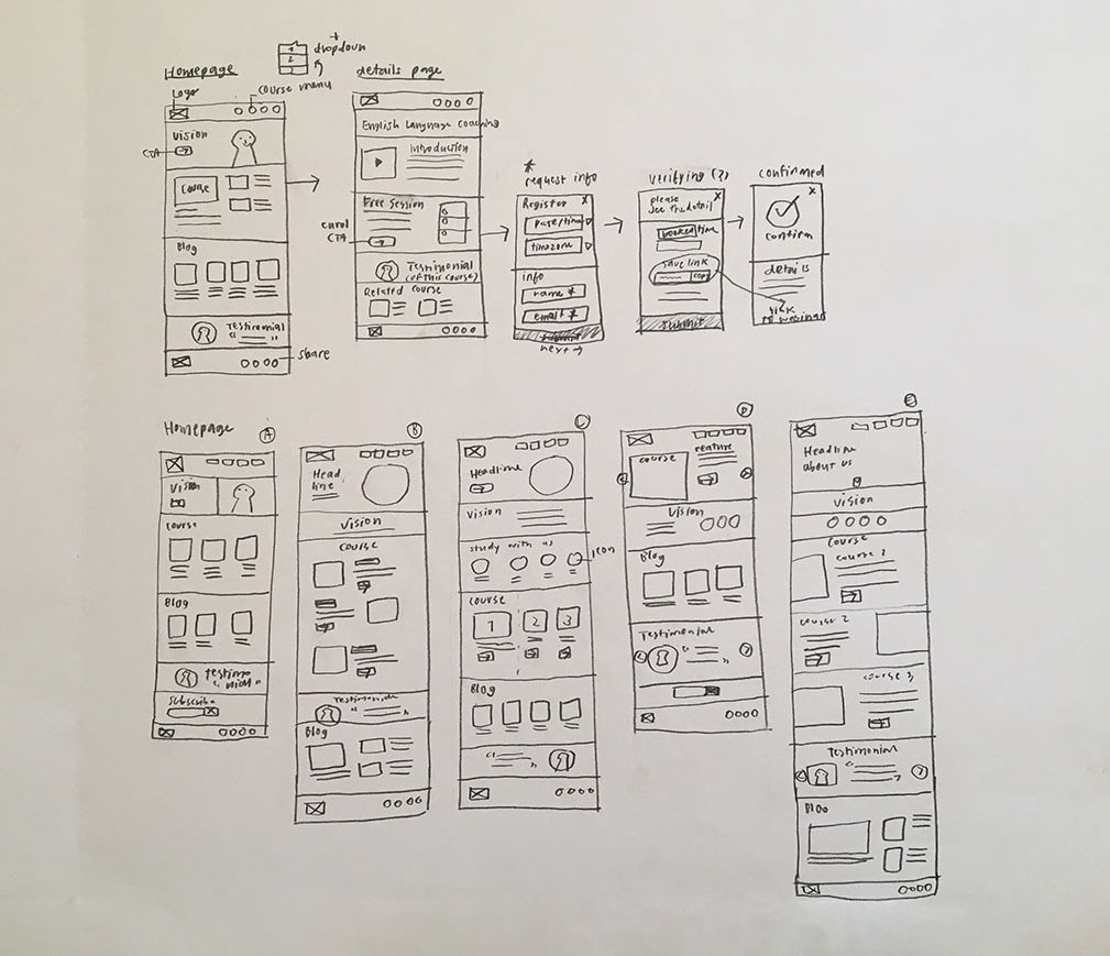
Ideation sketches
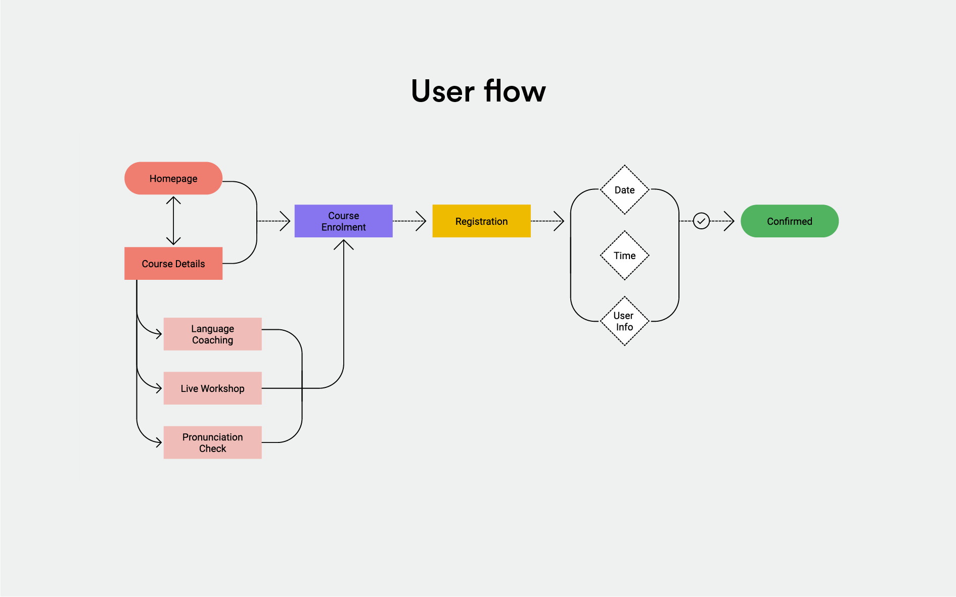
User flow
Ideation and Low-fidelity prototype
Generating the ideas and user flow with low-fidelity sketches convey all ideas to a visible version. Then I created a low-fidelity prototype to refine the idea after pencil sketches. To help users have a better vision of how the system works as for mockup testing.
I conducted 3 participants in usability testing. They were asked to review the system and to complete the registration task. After the test, each participant required to provide their feedback by answering the system usability scale questionnaire to validate the ideation of the prototype. Follow the feedback, their insight were used to synthesise for recommendations then mid-fidelity interactive prototype will produce.
Go to Mid-fidelity Prototype : https://www.figma.com/proto/IgjIRoHfZpGQJ0Z3LPSVW4/UX-User-Flow?node-id=284169%3A450&scaling=min-zoom
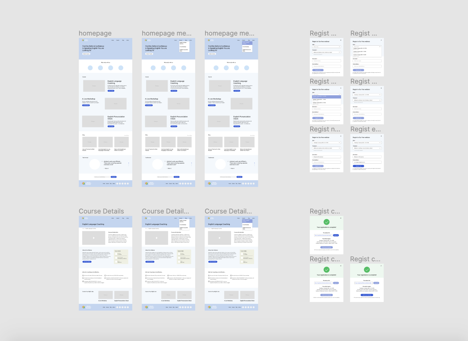
Low-fidelity Prototype
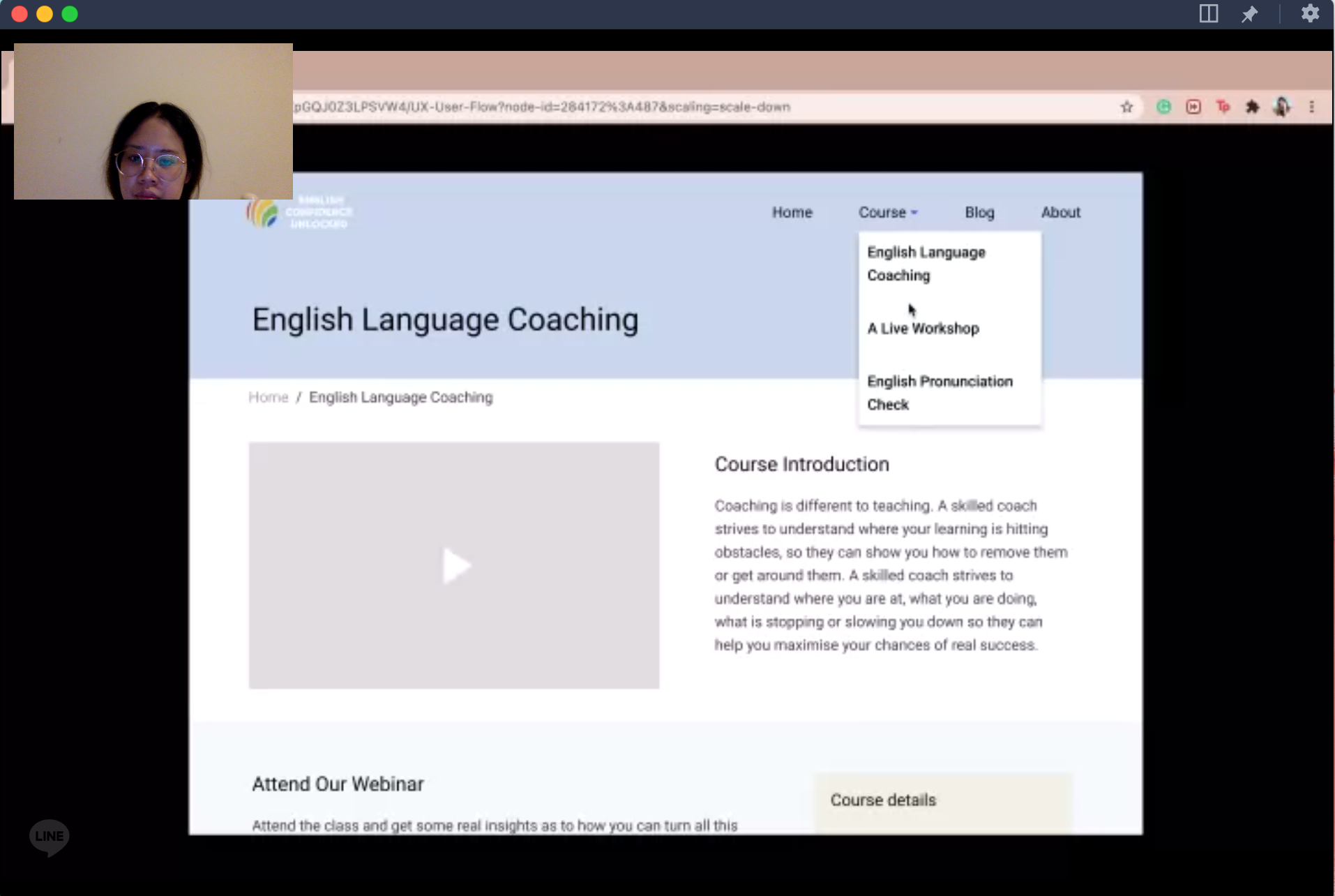
Usability Testing
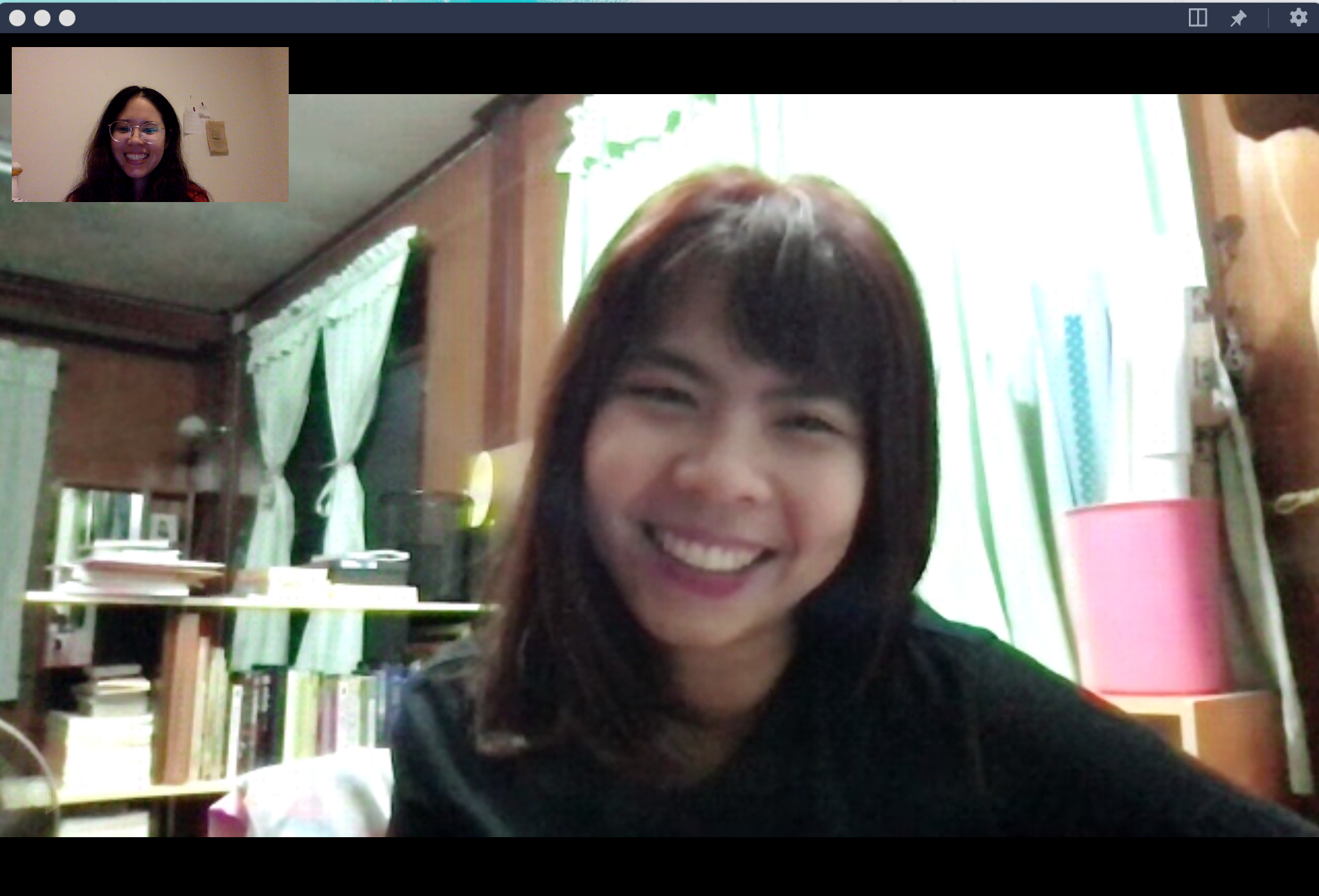
User Interview-02
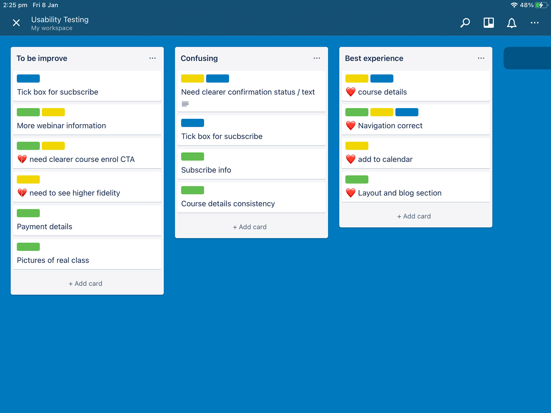
Affinity board of usability testing
Recommendations
The recommendations, gathered from the usability test of the low-fidelity prototyping, will use to develop the mid-fidelity prototyping.
1. To have more information about the free webinar i.e., what to expect from the session or anything learners should prepare before attending.
2. The tone of the messages has an effect on users to make a decision
3. Outstanding enrolment button would rather be seen at the top of the page without scrolling
4. Newsletter subscribe option would prefer to show at the registration checkout stage
5. Another confirmation page to acknowledge them that their task is already completed
What's next!
To validate the ideas of the mid-fidelity prototype, another round of testing is required.
Mid-fidelity mockup
